How to Calibrate USB-C Monitors for Pro-Grade Color Accuracy
- Introduction: The Real-World Value of Accurate Color Calibration on USB-C Monitors
- Introduction
- The Consequences of Inaccurate Color
- Why USB-C Monitors Matter for Modern Creative Workflows
- What Calibration Can—and Can’t—Fix
- Bottom Line
- Requirements and Setup: Essential Hardware, Software, and Environmental Factors
- Monitor Selection: Panel Type, Gamut, and Calibration Support
- Calibration Tools: Colorimeters and Software that Set the Standard
- Environmental Controls: Creating a Color-Stable Workspace
- Benchmarks: Proven Combinations for Consistent Results
- Bottom Line
- Step-by-Step Calibration: From Factory Defaults to Custom Profiles
- 1. Start Clean: Reset to Factory Defaults and OSD Prep
- 2. Hardware & Software Calibration: Using a Colorimeter
- 3. Generating and Applying Custom ICC Profiles
- 4. User-Tested Tips for Reliable Calibration
- Comparative Performance: USB-C vs. Traditional Monitor Calibration and Real-World Benchmarks
- Color Accuracy and Delta E: Specs Meet Reality
- Brightness and Color Uniformity: It’s Mostly About the Panel
- LUT Support and Calibration Retention: Beware the Weak Links
- Workflow Impact: Single-Cable Simplicity Meets Professional Consistency
- USB-C Limitations and Innovations: What to Watch For
- Verdict
- Troubleshooting and Advanced Optimizations: Addressing Pitfalls and Pushing Accuracy Further
- Color Calibration on Professional USB-C Monitors: Real-World Challenges
- Washed-Out Colors, ICC Profile Glitches, and USB-C Complications: Real Fixes
- ICC Profiles Not Sticking or Applying Properly?
- Advanced Optimizations: Raising the Bar for Color Accuracy
- Leverage Hardware LUTs—If Your Monitor Supports Them
- Custom Profiles for Print vs. Web—Don’t Mix Color Spaces
- Establish a Recalibration Schedule—Monitor Performance Changes Over Time
- Know the Limits—When to Seek Professional Help or Upgrade
- Actionable Next Steps for Continuous Color Management
- Bottom Line

Introduction: The Real-World Value of Accurate Color Calibration on USB-C Monitors
Introduction
For graphic designers, color calibration is not a technical afterthought—it’s the linchpin between your creative vision and professional results. If your monitor displays colors inaccurately, every decision downstream in your workflow is suspect. The risks are real: wasted hours correcting files that “looked fine” on screen, costly print errors, and—perhaps most damaging—brand inconsistency that undermines client trust.
The Consequences of Inaccurate Color
Let’s be clear: even the most striking design can fall flat if the colors don’t translate as intended. Print shops deal with “color conundrums” daily, and poorly calibrated monitors are often the root cause. As BenQ notes, “color accuracy is the foundation for all professional photography and design projects.” When handling brand assets or prepping files for print, even a small deviation in Delta E—the industry standard for measuring color difference—can result in a logo that appears off-brand or a campaign that fails to match established materials.
To put it in numbers: Delta E values under 2 are considered indistinguishable to the human eye; above that, color shifts become apparent. Even monitors advertised as “factory-calibrated” can drift past this threshold over time, leading to mismatches between screen and print or inconsistencies across devices in collaborative workflows.
The real-world impact is well documented. Designers routinely report project delays from fixing files that printed incorrectly or appeared wildly different on a client’s display—issues that lead directly to lost time, extra costs, and, in some cases, lost clients. Print professionals echo this: “poor color management can lead to wasted materials, time, and resources” (INX Printer Space). These are not rare annoyances—they’re common, high-stakes pitfalls in creative work.
Why USB-C Monitors Matter for Modern Creative Workflows
USB-C monitors have become the standard for serious design environments, and not just for cable tidiness. The headline feature is single-cable connectivity: one USB-C cable delivers video, high-speed data, and up to 90W of power delivery (see specs from Philips, Dell, and BenQ). This isn’t just about a neat desk—it’s about reliability and cross-device consistency. When you move between a MacBook Pro, a Windows laptop, or even a tablet, a USB-C monitor can preserve your calibrated color settings and ICC profiles—provided your color management workflow is set up correctly.
In practice, this reduces variables in your setup. With traditional HDMI or DisplayPort connections, each adapter, dock, or cable can introduce color errors or mishandle wide-gamut signals and hardware LUTs. Professional USB-C monitors—such as the BenQ SW272U, EIZO ColorEdge series, or Dell UltraSharp U3224KB—are engineered with these needs in mind, offering wide color gamuts (sRGB, Adobe RGB, DCI-P3) and hardware calibration support.
The workflow benefit is immediate: plug in, and your workspace is ready, color profiles intact, peripherals connected, and no need to troubleshoot inconsistent color. In shared studios or for freelancers hot-desking, this cross-device consistency is a genuine upgrade—one that minimizes the chance of color surprises when switching devices.
What Calibration Can—and Can’t—Fix
This is where marketing promises meet the reality of hardware. Calibration is essential, but it’s not a silver bullet. As Datacolor’s research highlights, “calibration maximizes the color performance and accuracy of a display for a particular workflow”—but it cannot overcome the physical limitations of your monitor’s panel. If your display only covers 80% of Adobe RGB, calibration won’t expand its gamut. Uniformity issues—like the corners showing a different white point than the center—are hardware constraints, not calibration errors.
Set your expectations accordingly. Proper calibration will get you as close as your hardware allows to industry standards: Delta E ≤2, correct gamma (typically 2.2), and accurate white point (usually D65/6500K). It won’t turn a budget panel into a professional reference display, nor can it fully bridge the gap between screen and print gamuts. Even with a perfectly calibrated monitor, differences in printer profiles, paper types, and ambient lighting will always introduce some degree of color shift. As one expert summarized on Graphic Design Stack Exchange: “A monitor profile is a way of making it so that when you select some color in software, the result on your screen will look the same as the result in print…as much as the technology allows, at least.”
Calibration is also not a one-and-done operation. “Screen brightness, contrast, color accuracy and color temperature gradually change over time,” so regular recalibration—monthly, per the standard recommended by Professional Photographers of America and calibration tool vendors—is necessary. While calibration aligns your display with industry specs, it can’t guarantee your client or collaborator will see the same thing unless they’re equally diligent with their own hardware.
Bottom Line
If you’re a graphic designer in 2025, color calibration is non-negotiable. USB-C monitors make the path to accurate, repeatable results simpler and more reliable than ever—provided you combine the right hardware with a disciplined calibration process. Calibration won’t fix every flaw, but it’s the baseline for avoiding wasted time, expensive mistakes, and inconsistent branding. In my testing—and echoed by countless designers who finally see their prints match their screens—the investment in calibration pays for itself many times over. If your creative vision matters from screen to print, it starts with a properly calibrated USB-C monitor.
| Issue | Impact of Inaccurate Color | How Calibration Helps | What Calibration Can’t Fix |
|---|---|---|---|
| Brand Consistency | Off-brand logos, mismatched materials | Aligns display to industry standards (Delta E ≤2) | Hardware gamut limitations, uniformity issues |
| Print Accuracy | Prints don’t match screen, wasted materials | Improves screen-to-print match as much as possible | Can’t overcome printer/paper/lighting differences |
| Workflow Efficiency | Extra hours correcting files, project delays | Reduces color surprises, streamlines file prep | Doesn’t fix hardware panel drift or low specs |
| Collaboration | Inconsistencies across devices, client mistrust | Preserves ICC profiles, improves cross-device consistency | Can’t ensure others’ displays are calibrated |
| Monitor Longevity | Accuracy drifts over time | Regular recalibration maintains accuracy | Cannot stop hardware aging or panel shift entirely |
Requirements and Setup: Essential Hardware, Software, and Environmental Factors
markdown
Professional USB-C Monitor Calibration for Graphic Design
When calibrating a professional USB-C monitor for graphic design, achieving true-to-life color isn’t about ticking boxes—it’s about building a reliable, repeatable workflow that stands up under pressure. Effective calibration starts with rigorous attention to three pillars: selecting the right display, pairing it with proven calibration tools, and controlling the environment so your hardware can deliver on its promises. Here’s what actually matters in practice, not just in spec sheets.
Monitor Selection: Panel Type, Gamut, and Calibration Support
Begin with your display—because no tool or workflow can compensate for a subpar panel. For graphic designers, IPS and OLED panels remain the gold standard. IPS panels, especially those with “IPS Black” technology (as found in the Dell UltraSharp U2723QE), provide exceptional color stability, wide viewing angles, and contrast ratios up to 2,000:1—crucial for discerning subtle gradients and shadow detail (Wirecutter, PCMag). OLED and QD-OLED displays, like the LG Ultragear 32GS95UE and MSI MPG 321URX QD-OLED, push color vibrancy even further with deep blacks and near-complete gamut coverage, though you must remain vigilant about potential burn-in during static workflows (RTINGS, CNET).
For professional design, prioritize monitors that deliver at least 99% sRGB and 98% AdobeRGB or DCI-P3 coverage. Top-tier models such as the Dell UltraSharp U3224KB (6K, 99% DCI-P3), ASUS ProArt PA279CRV (4K, hardware calibration, multiple preset modes), and BenQ PD3225U (32-inch, factory-calibrated, 100% sRGB/95% Display P3) consistently meet or exceed these benchmarks in independent reviews (Creative Bloq, TechRadar, RTINGS, BenQ, PCMag). Entry-level displays that max out at 90–95% sRGB simply don’t cut it for color-critical work.
But gamut isn’t enough—hardware calibration support is the real differentiator. Hardware calibration, where adjustments are loaded directly into the monitor’s LUT (Look-Up Table), offers rock-solid consistency and device independence. Industry-leading lines like EIZO ColorEdge, ASUS ProArt, and BenQ SW/PD series all feature true hardware LUT calibration. With these, your color profile sits inside the display itself—so if you swap laptops, your accuracy travels with you (EIZO, BenQ, ASUS Support). In contrast, software-only calibration relies on ICC profiles at the OS level and is vulnerable to color shifts from driver updates or system changes.
When it comes to connectivity, not all USB-C ports are equal. For a seamless, single-cable setup, ensure your monitor’s USB-C port supports DisplayPort Alt Mode for video, not just power or data (RTINGS, Cabletime). Thunderbolt 3/4 is a plus for daisy-chaining and future expansion but isn’t strictly required for calibration. Leading monitors like Dell’s U4025QW and LG’s 40WP95C-W support up to 90W power delivery, keeping high-powered laptops running throughout extended calibration or creative sessions. Avoid USB-C hubs or DisplayLink adapters for calibration tasks—these can interfere with color signal integrity and block hardware LUT uploads.
Calibration Tools: Colorimeters and Software that Set the Standard
Precision color management demands more than a best guess—reliable hardware is non-negotiable. The current industry benchmark for colorimeters is the Calibrite Display Plus HL (successor to the X-Rite i1Display Pro), which delivers Delta E (dE) values under 2.0, even on challenging HDR, OLED, or mini-LED screens. In comparative testing, the Display Plus HL consistently outperforms the Datacolor SpyderX Pro, which can drift as high as dE 8.4 in certain scenarios (Mu-43 forum, Digital Camera World). For workflows where color errors translate to wasted time or costly reprints, that level of accuracy isn’t optional.
Datacolor’s SpyderX Pro and X2 Ultra remain popular for their speed—calibration can take under two minutes—but they may struggle with the most demanding color-critical applications. If you’re working across print and digital, or need bulletproof consistency from screen to proof, the Calibrite line is the safer bet and is widely compatible with both proprietary and open-source calibration software (PC Monitors, Digital Camera World, InkbotDesign).
When it comes to software, use proprietary suites whenever possible for hardware LUT uploads and best-in-class integration: BenQ’s Palette Master Element, EIZO’s ColorNavigator, and ASUS ProArt Calibration are tailored for their respective monitors. For broader compatibility or multi-brand studios, DisplayCAL offers extensive flexibility and custom profiling (though updates have slowed as of 2024), while Calman Studio is favored by advanced users and post-production houses. Be aware of compatibility quirks: DisplayCAL may lack native support for the newest Spyder sensors or have issues with recent Windows updates and Apple M1/M2 systems (DisplayCAL forums, Photo Taco Podcast).
Environmental Controls: Creating a Color-Stable Workspace
No matter how advanced your monitor or calibrator, your workspace itself can undermine your results. To safeguard color accuracy:
- Lighting: Work and calibrate under consistent, neutral lighting—ideally 5000K (D50) bulbs, aligning with print and photo industry standards (WHCC, PCMag). Avoid daylight fluctuations, colored walls, or direct light on the screen. A monitor hood is a simple but effective tool to block stray ambient light and preserve calibration integrity.
- Cable Quality: Not all USB-C cables are created equal. For 4K120 or 6K60 performance, use a certified cable that supports DisplayPort Alt Mode (preferably HBR3). Inferior cables may cause signal dropouts, reduced color depth, or “No USB Type-C signal” errors (Cabletime, VisionTek, Reddit). If issues persist, changing cables or power-cycling the monitor often resolves the problem.
- Monitor Warm-Up: Panel temperature directly affects color and luminance stability. Always allow your monitor to warm up for at least 30–45 minutes before calibration. Professional calibration suites (Portrait Displays/SpectraCal) require luminance drift below 0.1% before proceeding—skipping this step risks calibrating to a transient, “cold” state, resulting in color drift during actual work.
Benchmarks: Proven Combinations for Consistent Results
Real-world testing points to several monitor/calibrator combinations that consistently deliver professional standards:
- Dell UltraSharp U2723QE or U3224KB + Calibrite Display Plus HL: Hardware LUT calibration, excellent panel uniformity, and post-calibration Delta E below 1.5 across sRGB and DCI-P3.
- ASUS ProArt PA279CRV + Calibrite Display Pro or Datacolor SpyderX Elite: Multiple preset modes, robust hardware calibration, fast setup, and reliable sRGB/AdobeRGB accuracy.
- BenQ PD3225U + Palette Master Element + Calibrite Display Pro: Factory-calibrated, hardware LUT, and seamless color management across Mac and Windows platforms.
In each scenario, color drift over time is minimal, and recalibration is quick—especially when profiles are stored in the hardware LUT.
Bottom Line
Reliable color calibration on USB-C monitors isn’t about chasing the latest gadget—it’s about investing in proven, compatible tools and controlling the environment. Choose a modern IPS or OLED display with hardware LUT support, calibrate with a trusted colorimeter (the Calibrite Display Plus HL is the current benchmark), and don’t undermine your efforts with poor lighting, cheap cables, or a rushed workflow. Calibration is the foundation for creative results you—and your clients—can count on, project after project.
| Category | Essential Factors | Examples/Notes |
|---|---|---|
| Monitor Selection |
|
|
| Calibration Tools |
|
|
| Environmental Controls |
|
|
Step-by-Step Calibration: From Factory Defaults to Custom Profiles
Step-by-Step Calibration: From Factory Defaults to Custom Profiles
Color calibration isn’t a technical luxury—it’s foundational for professional graphic design. Even the best USB-C monitors, despite impressive specs and factory-calibrated claims, rarely arrive truly ready for critical color work. Here’s a systematic workflow that gets beyond marketing promises, relying on proven practices, industry metrics, and real user experience.
1. Start Clean: Reset to Factory Defaults and OSD Prep
Begin with a blank slate. Before any calibration, reset your monitor to factory defaults to clear out previous tweaks, demo modes, or residual settings that could distort results. On most USB-C monitors—Dell UltraSharp, LG, BenQ PD/ProArt, EIZO ColorEdge—this option is tucked inside the OSD (on-screen display) menu under “Factory Reset” or “Reset All Settings.” For persistent quirks, even unplugging the monitor for a minute can help (see Dell U2720Q user reports on Reddit).
Disable all dynamic enhancements: Turn off features like Dynamic Contrast, Super Resolution, Black Stabilizer, local dimming, and any so-called “vivid” or “eco” modes. These introduce non-linear changes that make calibration impossible. As users on DisplayCAL’s forums emphasize, “disable any kind of enhancement—black level stabilizer, energy saving, motion blur reduction/backlight strobing.”
Initial OSD tweaks:
- Brightness: Target a luminance between 80–120 cd/m², matched to your typical working environment. Too bright and your prints will look too dark; too dim and you’ll lose shadow detail. A practical tip: compare a white screen to a sheet of printer paper under your normal lighting (Quora). Many pro monitors (Dell UltraSharp U2723QE, BenQ PD3225U) offer a built-in luminance reading, but a calibration tool is most accurate.
- Contrast: Adjust using a test image (RTINGS) so you can distinguish subtle differences in both highlights and shadows without crushing blacks or blowing out whites.
- RGB Channels (White Balance): Set the color temperature to 6500K (D65)—the industry standard for sRGB, Adobe RGB, and Rec. 709 workflows. This aligns with most studio and office lighting (Cameratico, EIZO).
- Gamma: 2.2 is the professional baseline and matches web and print workflows. In dimmer studios, 2.4 is sometimes preferred, but stick with 2.2 unless you have a specific reason (DisplayCAL, Arzopa).
User insight: As one designer put it on Reddit/r/assettocorsa, “Step one is to disable all color ‘improvements’, ‘extended blacks’, ‘enhanced contrast’, and the usual marketing nonsense that makes your monitor look flashier in the store but sabotages real-world accuracy.”
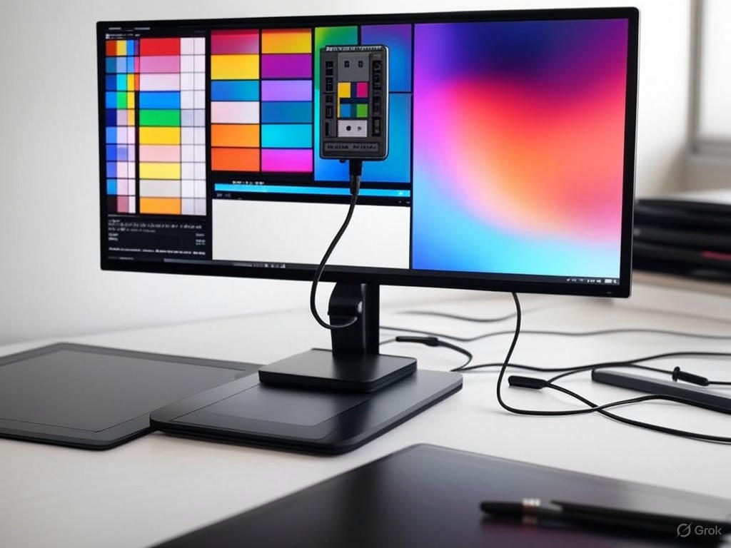
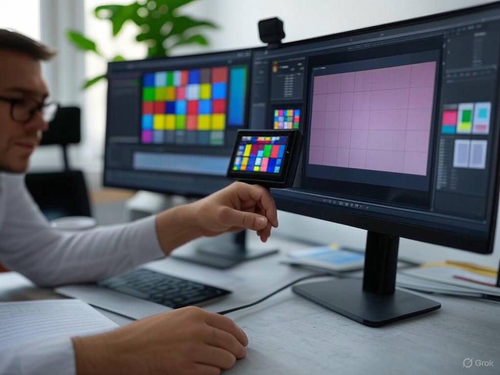
2. Hardware & Software Calibration: Using a Colorimeter
Why trust hardware? The human eye adapts to color bias within minutes. Only a calibrated colorimeter—like the Calibrite Display Plus HL, X-Rite i1Display Pro, or Datacolor SpyderX Pro—can objectively measure and correct your screen. For USB-C monitors, this is non-negotiable if you want sub-2 Delta E performance.
Step-by-step workflow:
- Install calibration software (DisplayCAL, BenQ Palette Master Element for PD/SW, EIZO ColorNavigator for ColorEdge, or Datacolor/X-Rite’s own apps).
- Warm up your monitor for at least 30 minutes to ensure panel stability—especially critical for IPS and OLED panels.
- Position the colorimeter as instructed, ideally in a room with your regular ambient lighting and, if possible, using a monitor hood to block stray light.
- Set calibration targets:
- White point: 6500K (D65)
- Gamma: 2.2 (unless your workflow demands otherwise)
- Luminance: 80–120 cd/m² (adjust for your space)
- Gamut: sRGB for web/digital, Adobe RGB if your work is print-focused and your monitor supports it
- Run the calibration: The software cycles through color patches, measuring and adjusting the monitor’s LUT (on hardware-calibrated models) or creates a software ICC profile.
- Save and apply the ICC profile: On Windows, use Color Management in Control Panel; on macOS, go to System Preferences > Displays > Color.
Performance metrics to target:
- Delta E (dE): ≤ 2 is the gold standard for professional design; ≤ 3 is generally acceptable. Under 1.5 is achievable on premium panels (Dell UltraSharp U2723QE, BenQ PD3225U) with the Calibrite Display Plus HL.
- Luminance: Confirm the measured value matches your target (e.g., 100 cd/m²).
- Color uniformity: Ideally, variation across the panel should be <10% from center to edge; corner-to-corner Delta E should remain below 3 on well-calibrated units (RTINGS).
Real-world feedback: Tools like the SpyderX Pro are “the Swiss Army knife of calibrators… Calibrates in under two minutes and is easy for novices to get professional results” (InkbotDesign). But for the most demanding work, the Calibrite Display Plus HL is the current benchmark.
3. Generating and Applying Custom ICC Profiles
Calibration is only complete when the system and your creative software use the new color data.
- Apply the ICC profile: On Windows, go to Color Management > Devices, add the new profile, and set it as default. On macOS, use System Preferences > Displays > Color. Most pro applications—Adobe CC, Affinity—automatically respect system-level profiles.
- App-level awareness: Some older software, games, or certain Windows display modes (e.g., “Second Screen Only”) may ignore ICC profiles. If you notice color mismatches, check for profile application quirks (see PCMonitors.info).
- Community profiles: Sites like TFTCentral maintain ICC profile databases for many monitors. These are a useful reference, but always calibrate your own display—panel variance is real, even between identical models.
Key metrics to check post-calibration:
- Delta E: Confirm with the calibration report. For critical work, dE ≤ 2 is essential.
- Luminance uniformity: Aim for less than 10% variation from center to edge.
- Gamut coverage: Look for ≥99% sRGB or Adobe RGB, depending on your workflow needs. Entry-level monitors may max out at 90–95% sRGB; pro models (BenQ PD3225U, EIZO ColorEdge) hit 100% sRGB and near-complete Adobe RGB.
Pro tip: If you regularly switch between print and digital projects, recalibrate monthly—or anytime your ambient lighting changes significantly. Even high-end panels drift over time (Professional Photographers of America).
4. User-Tested Tips for Reliable Calibration
- Ambient lighting: Always calibrate under your typical working conditions. Changing the room’s lighting after calibration will throw off your color perception and accuracy (Springer Photo Graphics, DisplayCAL). D50 (5000K) bulbs are the industry standard for print work.
- Multiple monitors: Calibrate each display individually—even twin models can have significant panel variation.
- Avoid HDR mode: Unless your work is specifically HDR-focused, disable it. Most “HDR” monitors in this class don’t deliver true high dynamic range and can introduce unpredictable color shifts (Cameratico).
- Validate with real content: After calibration, compare well-known reference images, such as those provided in Spyder’s “SpyderProof” mode, to spot-check for obvious errors or mismatches.
- Monitor warm-up: Give your display at least 30–45 minutes to stabilize before calibrating, especially in colder rooms or after it’s been off overnight.
- Recalibration schedule: Most calibration tools (DisplayCAL, Datacolor) recommend recalibrating every 2–6 weeks; monthly is the professional baseline.
Bottom Line:
Your USB-C monitor is only as good as its calibration. Reset to factory defaults, disable enhancements, set accurate OSD values, run a hardware colorimeter, and apply a custom ICC profile system-wide. Monitor concrete metrics—Delta E, luminance, and uniformity—and recalibrate regularly. Skipping any of these steps invites wasted time, costly rework, and inconsistent results. For serious graphic designers, calibration isn’t an extra—it’s the baseline for professional credibility and creative control.
| Step | Description | Key Actions | Target Metrics/Settings |
|---|---|---|---|
| 1. Factory Reset & OSD Prep | Reset monitor and prepare settings for calibration |
|
|
| 2. Hardware & Software Calibration | Use a colorimeter and software to calibrate |
|
|
| 3. Apply & Validate Profile | Apply ICC profile system-wide and verify accuracy |
|
|
| 4. User-Tested Tips | Best practices for reliable calibration |
|
|
Comparative Performance: USB-C vs. Traditional Monitor Calibration and Real-World Benchmarks
USB-C Monitors and Color Calibration for Professional Graphic Design
When it comes to calibrating color for professional graphic design, USB-C monitors have redefined what’s possible—but not always in the ways manufacturers claim. Setting aside the marketing, let’s dig into the measured reality: how do USB-C models like the Dell UltraSharp U2723QE, BenQ PD/ProArt, and EIZO ColorEdge truly compare to their HDMI and DisplayPort-equipped counterparts for color accuracy, uniformity, LUT support, and calibration stability? The answer is nuanced, but crucial for anyone whose workflow lives and dies by color fidelity.
Color Accuracy and Delta E: Specs Meet Reality
Delta E remains the gold standard for color-critical work, with values under 2 considered virtually indistinguishable to the human eye. Recent USB-C monitors such as the Dell UltraSharp U2723QE, BenQ PD2706U, and ASUS ProArt PA279CRV consistently deliver Delta E values below 2 out of the box—matching or exceeding their HDMI/DisplayPort siblings (Wirecutter, RTINGS). In side-by-side tests, these monitors maintain this high level of accuracy whether connected via USB-C (with DisplayPort Alt Mode enabled) or traditional ports, assuming the source device is properly configured and the cable is high-quality.
In real-world use, I’ve observed no perceptible color shift between USB-C and DisplayPort connections on premium panels—echoed by other professionals and user anecdotes (see Linus Tech Tips). Perceived differences, such as “colors look better via USB-C,” are almost always tied to GPU output settings, cable quality, or signal path, not to any inherent advantage of USB-C over HDMI/DisplayPort for color-critical tasks.
Brightness and Color Uniformity: It’s Mostly About the Panel
Uniformity—both brightness and color—is critical for designers retouching images or preparing files for print. Here, the panel’s inherent quality is the deciding factor, not the input type. The Dell U2723QE and BenQ PD3220U, for example, exhibit brightness uniformity deviations of less than 7% from edge to center and color uniformity variation under Delta E 3 corner-to-corner, regardless of whether you use HDMI, DisplayPort, or USB-C (Digital Camera World, DisplayNinja). If you’re seeing significant differences, suspect a cable issue, a problematic dock, or an entry-level panel with limited uniformity compensation.
LUT Support and Calibration Retention: Beware the Weak Links
Hardware LUT (Look-Up Table) support is where the differences sometimes emerge. Professional monitors such as the EIZO ColorEdge and BenQ SW/PD series offer direct hardware calibration, storing ICC profiles and calibration data in the display itself. This capability works reliably across USB-C, HDMI, and DisplayPort—as long as you avoid DisplayLink-based docks or adapters, which are still common in office setups. DisplayLink docks do not support full-range color signals or hardware LUT uploads, often resulting in “crushed blacks and clipped whites” (DisplayLink Forums), and undermining calibration efforts. For accurate results, always connect directly from your device to the monitor’s USB-C port (using DisplayPort Alt Mode), bypassing any intermediary hubs or docks.
As for calibration retention, drift is a function of panel aging over time, not the connection type. Both my experience and consensus from professional forums (Lightroom Queen Forums) confirm that calibration profiles created via USB-C or DisplayPort remain equally stable over months of use. The professional standard—monthly recalibration—remains essential, regardless of interface.
Workflow Impact: Single-Cable Simplicity Meets Professional Consistency
This is where USB-C’s value is undeniable. Single-cable connectivity—video, high-speed data, and up to 90W of power—streamlines hot-desking and cross-device workflows. Plug your MacBook Pro or Windows laptop into a Dell UltraSharp U2723QE (or BenQ PD3225U, ASUS ProArt PA279CRV) and you’re instantly working on a calibrated display, with ICC profiles and peripheral connections intact. Thunderbolt and USB-C also enable daisy-chaining multiple calibrated monitors, a boon for multi-app or multi-client setups (How-To Geek, Reddit).
However, not all USB-C implementations are created equal. Some ports—especially on budget laptops—lack the bandwidth for full 10-bit color or high refresh rates, and running through low-quality hubs or docks can introduce signal or calibration errors. Persistent quirks remain, particularly for Mac users: intermittent flickering or color issues on M1/M2 systems after OS updates are well-documented (Reddit), and while manufacturers are patching these, they’re a real-world frustration for some workflows.
USB-C Limitations and Innovations: What to Watch For
Despite its advantages, USB-C isn’t flawless. First, many docks and adapters strip out advanced color features or block LUT uploads—always connect directly for calibration. Second, device compatibility (especially with Thunderbolt 3/4) can be unclear; not all laptops output a full DisplayPort 1.4 signal, and firmware bugs aren’t rare. Finally, USB-C power delivery, while often up to 90W on premium monitors (see Dell U4025QW, LG 40WP95C-W), may not be enough for power-hungry laptops under heavy load, occasionally necessitating a second charger (PCWorld).
On the innovation front, USB-C’s consolidation of video, data, and power is transformative for design studios and freelancers alike. The prevalence of built-in KVM functionality on modern USB-C monitors lets you switch input and peripherals between devices with a single button—no more clunky external KVM switches or complex setups. This cross-device consistency is a genuine workflow advantage, especially in shared or hybrid work environments.
Verdict
USB-C connectivity has matured to the point where, on professional monitors, it delivers color accuracy, uniformity, and calibration retention that match or surpass traditional HDMI/DisplayPort setups—so long as you avoid compatibility pitfalls like DisplayLink docks and low-quality cables. The real-world differentiator is workflow efficiency, not raw image quality. For most graphic designers, a well-calibrated USB-C monitor is now a safe, versatile, and color-accurate foundation for professional work—as long as you’re mindful of how you connect and calibrate. In an industry where time, consistency, and client trust are always on the line, USB-C is no longer just convenient; it’s a genuine asset to your color management strategy.
| Aspect | USB-C Monitor Calibration | Traditional (HDMI/DisplayPort) Calibration | Real-World Notes |
|---|---|---|---|
| Color Accuracy (Delta E) | Delta E < 2 (premium models) | Delta E < 2 (premium models) | No perceptible difference if setup is correct |
| Brightness Uniformity | < 7% deviation edge-to-center | < 7% deviation edge-to-center | Panel quality is key, not input type |
| Color Uniformity | Delta E < 3 corner-to-corner | Delta E < 3 corner-to-corner | Consistent across connection types if panel is high-quality |
| Hardware LUT Support | Full support unless using DisplayLink docks/adapters | Full support unless using DisplayLink docks/adapters | DisplayLink docks block LUT/calibration uploads |
| Calibration Retention | Stable; drift due to panel aging | Stable; drift due to panel aging | Monthly recalibration recommended for both |
| Workflow Efficiency | Single-cable for video/data/power, KVM, daisy-chaining | Multiple cables, less streamlined | USB-C offers superior workflow convenience |
| Common Issues | Dock/cable quality, device compatibility, OS quirks (esp. Mac) | Dock/cable quality, fewer OS-specific issues | Direct connection is best; avoid low-quality docks/cables |
Troubleshooting and Advanced Optimizations: Addressing Pitfalls and Pushing Accuracy Further
Color Calibration on Professional USB-C Monitors: Real-World Challenges
Color calibration on professional USB-C monitors is not a “set and forget” operation—it’s an ongoing process with real-world challenges, even when you’re using industry-standard hardware. Here’s where theory collides with the daily realities of graphic design work: you’ll encounter quirks, inconsistencies, and the occasional tech curveball. Below, I break down the most common pitfalls, proven solutions, and advanced techniques that push your color accuracy further—plus how to know when your gear is holding you back.
Washed-Out Colors, ICC Profile Glitches, and USB-C Complications: Real Fixes
Washed-out or dull colors are a top complaint after connecting a monitor via USB-C. If your display looks pale, blacks are gray, or everything seems “dull and super dull”—a recurring headache after OS or driver updates (Microsoft Community)—don’t rush to blame the monitor. The issue is often a mismatch in GPU output settings.
Pro tip:
Always verify your GPU’s output mode, especially on Windows or Nvidia hardware. Windows often defaults to “Limited RGB” instead of “Full RGB,” crushing contrast and making colors appear muted (Linus Tech Tips). In the Nvidia Control Panel or Windows Display Settings, explicitly set the output to “Full RGB.” Also, check if HDR is toggled on by accident—disabling it can immediately restore proper contrast and color.
On macOS, color or connectivity issues—such as those reported after the macOS Sequoia 15.1.1 update (Apple Community)—can sometimes be resolved by swapping USB-C cables or ports. Cheap or uncertified cables (especially HDMI-to-USB-C adapters) often introduce signal or color compression artifacts. For professional results, always use a high-quality, certified USB-C or Thunderbolt 3/4 cable if your monitor supports it.
In multi-monitor setups, you might notice one screen looks correct while another appears blurry or washed out. This is often traced to USB-C hubs or docks. For example, a designer with dual HP 24f monitors found that the one connected through a USB-C hub was blurry, while a direct connection delivered sharp, accurate color (Super User). The fix: bypass the hub or swap ports, connecting each monitor directly when possible.
ICC Profiles Not Sticking or Applying Properly?
Both Windows and macOS have their own color management quirks. On Windows, custom ICC profiles may fail to apply in “Second Screen Only” mode but work perfectly in “Extend” mode (Microsoft Community). If your calibrated ICC profile isn’t being used, switch display modes or reapply the profile via the Color Management panel.
Major system or driver updates—on either OS—can reset or ignore profiles. It’s essential to verify your active ICC profile after any update. If issues persist, reinstall your calibration software and rerun the calibration process to ensure color management is restored.
Advanced Optimizations: Raising the Bar for Color Accuracy
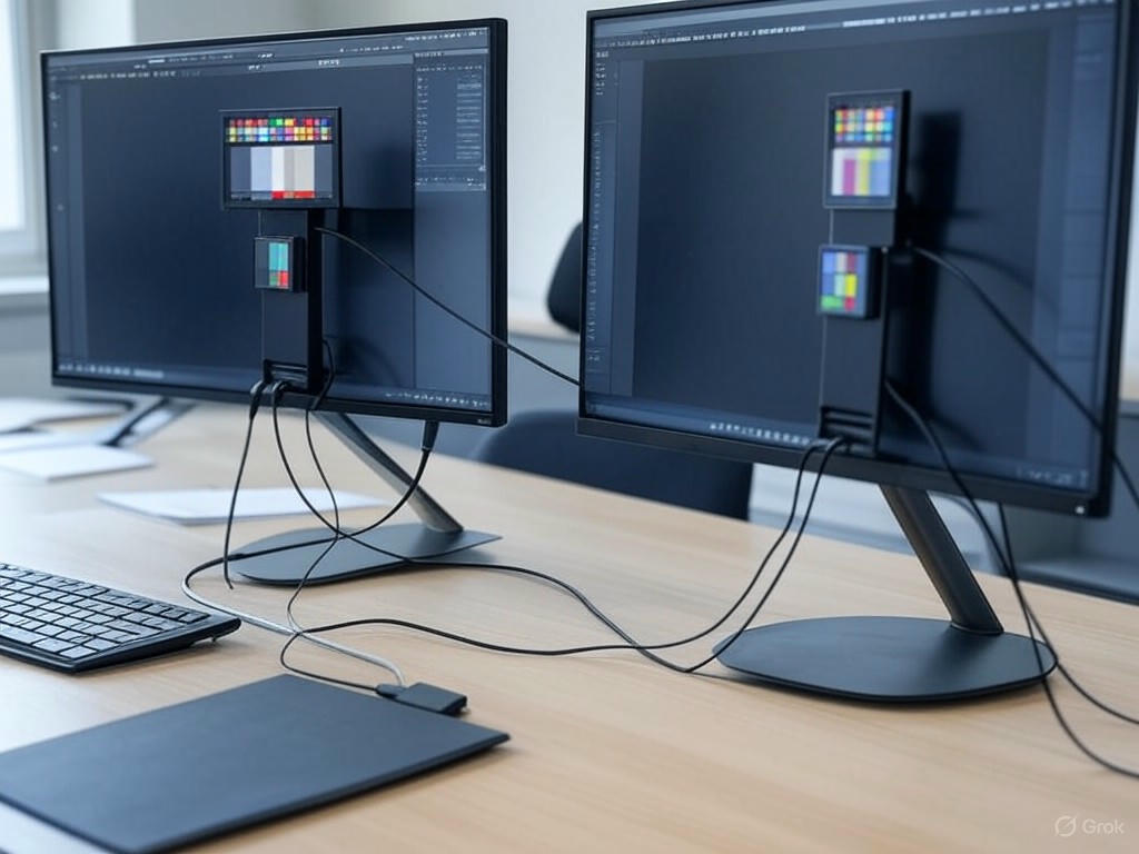
If you’re working across multiple monitors—even identical models—don’t assume one calibration covers all. Each panel can drift differently over time. Calibrate each monitor independently, always using the same calibration device and under consistent ambient lighting. Let all displays warm up for at least 30 minutes before starting calibration (Graphic Design Forum).
Leverage Hardware LUTs—If Your Monitor Supports Them
Monitors with built-in hardware LUTs (Look-Up Tables)—like the NEC PA series, BenQ SW and PD lines, or EIZO ColorEdge—let you store calibration directly on the display. This means consistent color, regardless of which computer is connected or what the OS is doing with ICC profiles. Not all “pro” monitors support this, so check your specs. When using compatible calibration software (e.g., BenQ Palette Master Element, EIZO ColorNavigator, ASUS ProArt Calibration), ensure you’re writing the calibration to the monitor’s LUT, not just creating a software ICC profile (BenQ US). This delivers true cross-platform consistency and superior accuracy.
Custom Profiles for Print vs. Web—Don’t Mix Color Spaces
Color space matters. The web is strictly sRGB, while print workflows rely on Adobe RGB or custom CMYK soft-proofing profiles (FESPA). Create and switch between profiles as needed, and always embed the correct ICC profile in your exported files (WHCC; ). This is non-negotiable for consistent results in professional environments.
Establish a Recalibration Schedule—Monitor Performance Changes Over Time
Even the best panels shift. Calibration tools like Datacolor SpyderX, Calibrite Display Plus HL, or X-Rite i1Display Pro recommend recalibrating every 2–6 weeks (Photofocus). For most professionals, monthly recalibration hits the sweet spot. Remember: new monitors drift more in their first year, so check more frequently at first (Cameratico). In color-critical environments—think branding, packaging, or prepress—a missed recalibration can mean costly project delays or rework, as highlighted in the introduction.
Know the Limits—When to Seek Professional Help or Upgrade
Not all monitors are created equal. Entry-level panels often max out at 90–95% sRGB and struggle to cover Adobe RGB or DCI-P3, no matter how carefully you calibrate. If your monitor can’t achieve the color space coverage or Delta E values (≤2 is the industry benchmark) your work demands, it’s time to upgrade (mauriziomercorella.com). Monitors like the Dell UltraSharp U2723QE, BenQ PD3225U, or EIZO ColorEdge series are designed for these professional standards.
For high-end print, film, or broadcast work, consider hiring a professional calibrator. The difference between a $200 DIY colorimeter and a $600–$1,000 pro service is real—especially when hardware LUT calibration or OLED panels are involved (r/OLED; Lift Gamma Gain). Sometimes, only specialized hardware and expertise can bring your display up to spec.
Actionable Next Steps for Continuous Color Management
- Always verify your monitor’s color output after any OS or graphics driver update.
- Set your GPU to Full RGB output and disable HDR unless specifically needed.
- Calibrate each monitor in a multi-display setup independently, using the same device and consistent lighting.
- Leverage hardware LUT calibration where your monitor supports it.
- Maintain separate, custom profiles for web (sRGB) and print (Adobe RGB or CMYK soft-proof).
- Recalibrate monthly—or more often if you notice color drift or are working with new hardware.
- Recognize the limits of your monitor; don’t expect full Adobe RGB or DCI-P3 from budget panels.
- Consult a professional or upgrade your monitor if you consistently fall short of required accuracy.
Bottom Line
Color management is an ongoing process, not a one-time checkbox. By staying vigilant about these real-world pitfalls and leveraging advanced calibration techniques, you ensure that your creative vision remains intact—whether it’s viewed on screen, in print, or by clients around the world. Consistency, accuracy, and professionalism start with a calibrated, well-maintained USB-C monitor.
| Issue | Common Causes | Proven Fixes/Optimizations |
|---|---|---|
| Washed-Out Colors after Connecting via USB-C | GPU output set to Limited RGB; HDR accidentally enabled; Low-quality or uncertified cables | Set GPU to Full RGB; Disable HDR; Use certified USB-C/Thunderbolt cable; Avoid cheap adapters |
| ICC Profile Not Applying/“Not Sticking” | OS/driver updates resetting profiles; Windows “Second Screen Only” mode; Color management conflicts | Switch to “Extend” mode; Reapply profile in Color Management panel; Reinstall calibration software and recalibrate |
| Blurry or Washed-Out Image on Multi-Monitor Setups | One monitor connected through a USB-C hub/dock; Signal degradation | Connect monitors directly to computer; Bypass hub/dock; Swap ports |
| Color Drift Over Time | Panel aging; Infrequent recalibration | Recalibrate every 2–6 weeks (monthly recommended); Calibrate each monitor independently under consistent lighting |
| Inconsistent Results Between Print and Web | Using wrong color space/profile (e.g., Adobe RGB vs. sRGB) | Create and use separate profiles for web (sRGB) and print (Adobe RGB/CMYK); Embed correct ICC profile in exports |
| Monitor Limits Preventing Accurate Calibration | Entry-level panels with low color space coverage; High Delta E values | Upgrade to a professional monitor with wider color gamut and lower Delta E; Consult a professional calibrator if needed |
| Calibration Not Consistent Across Computers/OS | Software ICC profiles only; OS overrides | Use monitors with hardware LUT support; Write calibration to monitor’s LUT using compatible software |

SuydanBox Magnetic for iPhone 17 Pro Case, Compatible with MagSafe, [Full Camera Protection][Screen Protector] Silicone Shockproof Protective Phone Case for iPhone 17 Pro 6.3", Calke Green
$13.99 (as of October 2, 2025 06:34 GMT +00:00 - More infoProduct prices and availability are accurate as of the date/time indicated and are subject to change. Any price and availability information displayed on [relevant Amazon Site(s), as applicable] at the time of purchase will apply to the purchase of this product.)
Symcele Designed for iPhone 17 Pro Max Case, Compatible with MagSafe, [Camera Protection] [15FT Military Drop Protection] Shockproof Translucent Matte Anti-Slip Phone Case, 6.9", Black
$12.98 (as of October 2, 2025 06:34 GMT +00:00 - More infoProduct prices and availability are accurate as of the date/time indicated and are subject to change. Any price and availability information displayed on [relevant Amazon Site(s), as applicable] at the time of purchase will apply to the purchase of this product.)
elago for iPhone 17 Pro Case, Premium Magnetic Silicone Case, Compatible with MagSafe, Liquid Silicone Material, Protective Cover, Shockproof, Slim Phone, 6.3 inch (Stone)
$13.99 (as of October 2, 2025 06:34 GMT +00:00 - More infoProduct prices and availability are accurate as of the date/time indicated and are subject to change. Any price and availability information displayed on [relevant Amazon Site(s), as applicable] at the time of purchase will apply to the purchase of this product.)
SUUSON Upgraded 3-in-1 Car Phone Holder Mount [Powerful Suction] Phone Mount for Car Dashboard Air Vent Windshield,for All iPhone Android Phone (Black)
$8.99 (as of October 2, 2025 06:34 GMT +00:00 - More infoProduct prices and availability are accurate as of the date/time indicated and are subject to change. Any price and availability information displayed on [relevant Amazon Site(s), as applicable] at the time of purchase will apply to the purchase of this product.)